Concept Art
I decided before going into animation tests to go into designing the characters.
First of all starting with Ethel, I wanted to find what pen I should use for the animation. Trying a few different ‘Kyle Brushes’ (a pack of Adobe Photoshop brushes) to experiement with different looks (while at the same time practicing her face drawings).

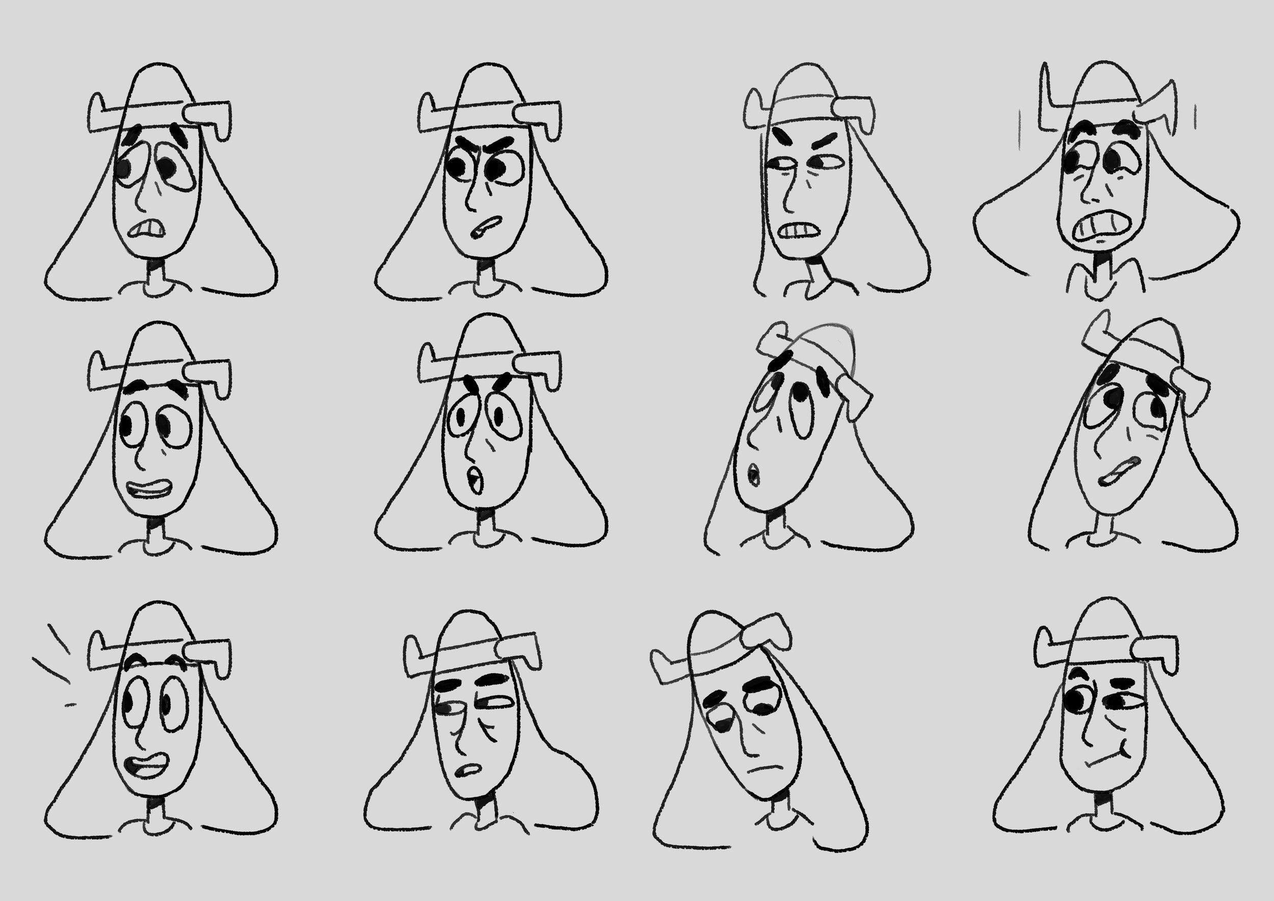
Through trying the different pens I found, also asking family and friends. I decided to choose the ‘old nib’ pen. It had a nice rusty, loose feeling that showed off that rebelious feeling with it’s patchy-ness. Reminds me kind of roughness in a child’s drawing. Also drawing the faces multiple times helped in concentrating the features I liked and keeping a cartoony look.
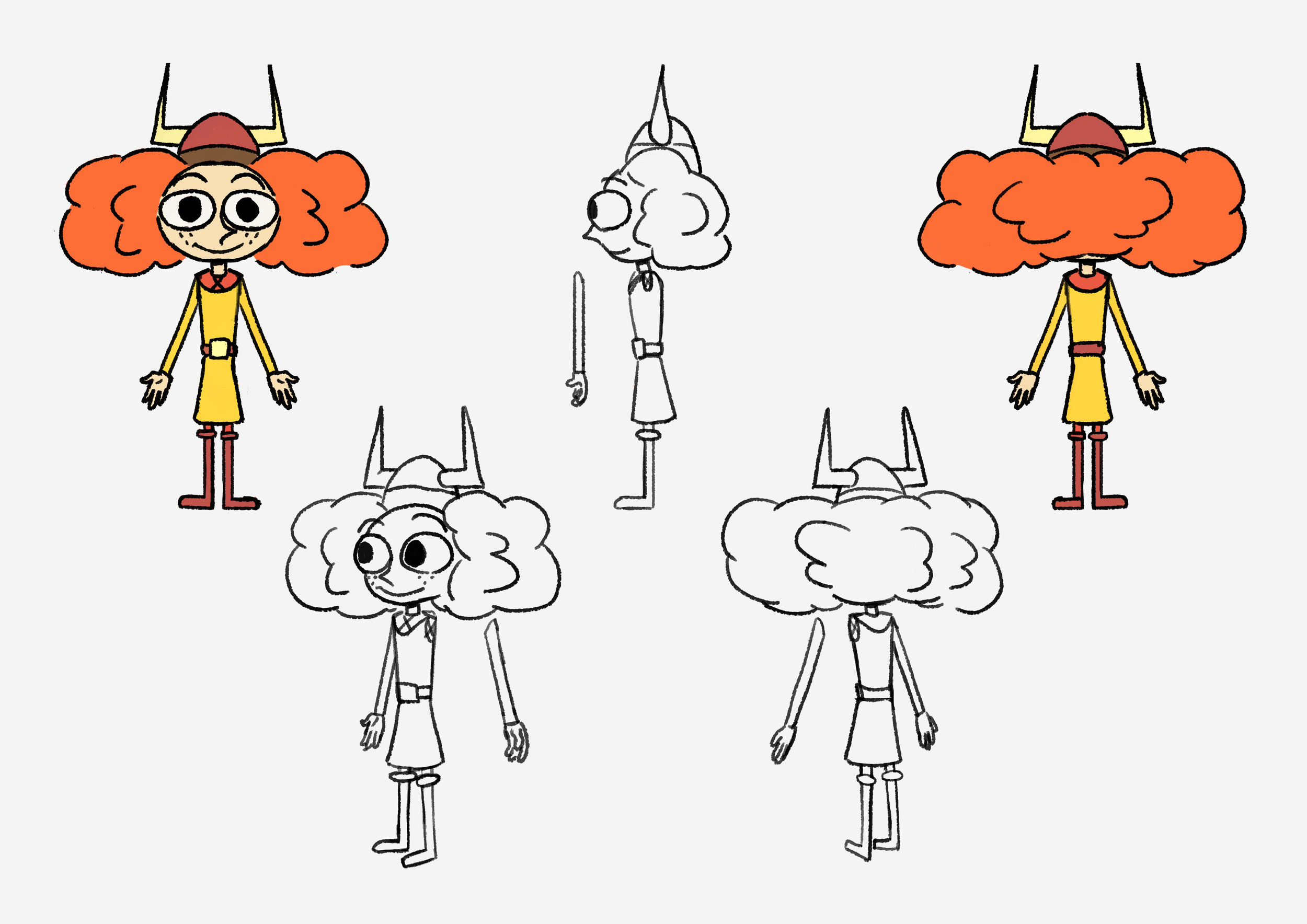
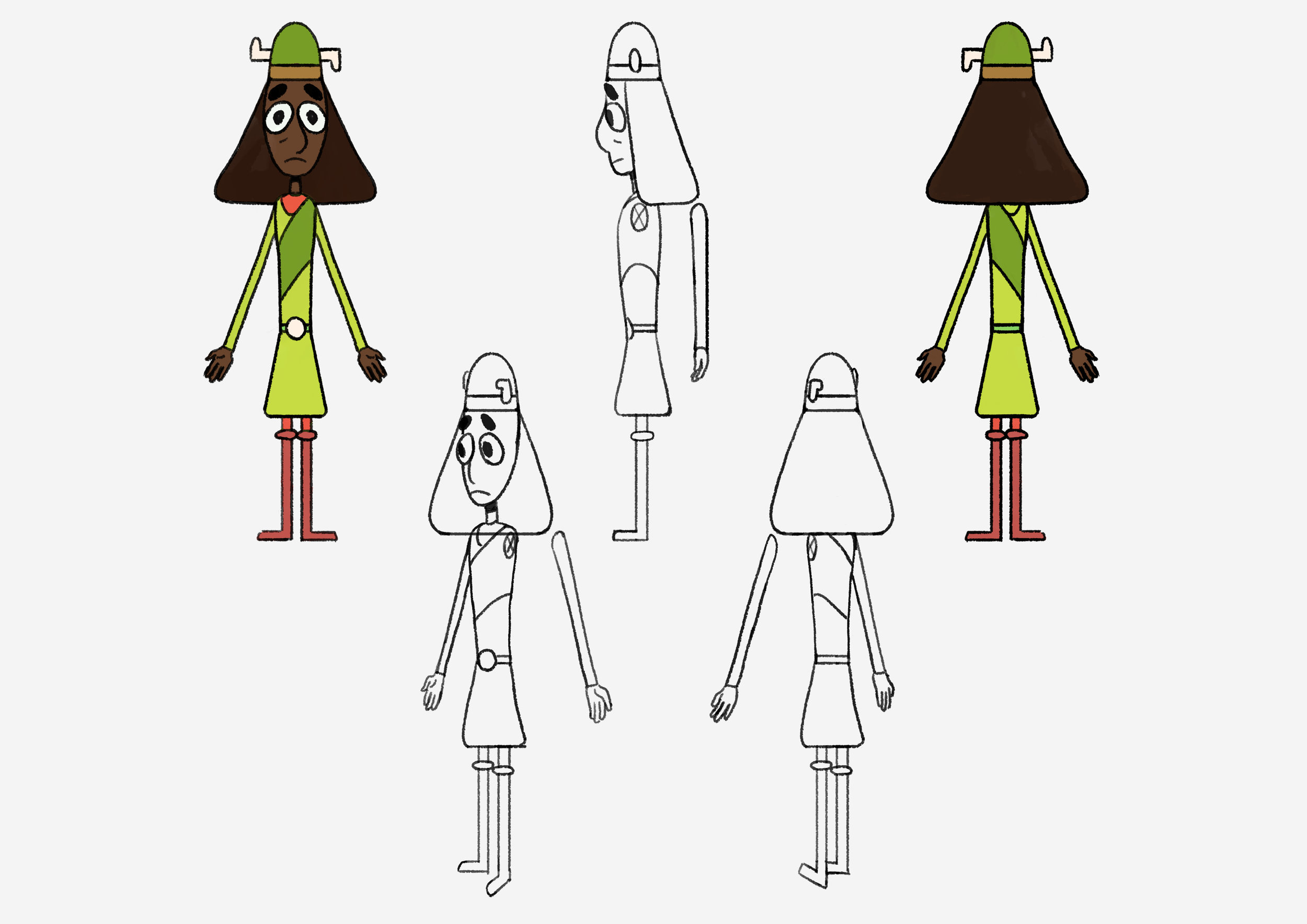
Moving on I decided to draw the constructions, play with the colours and see how she would move.
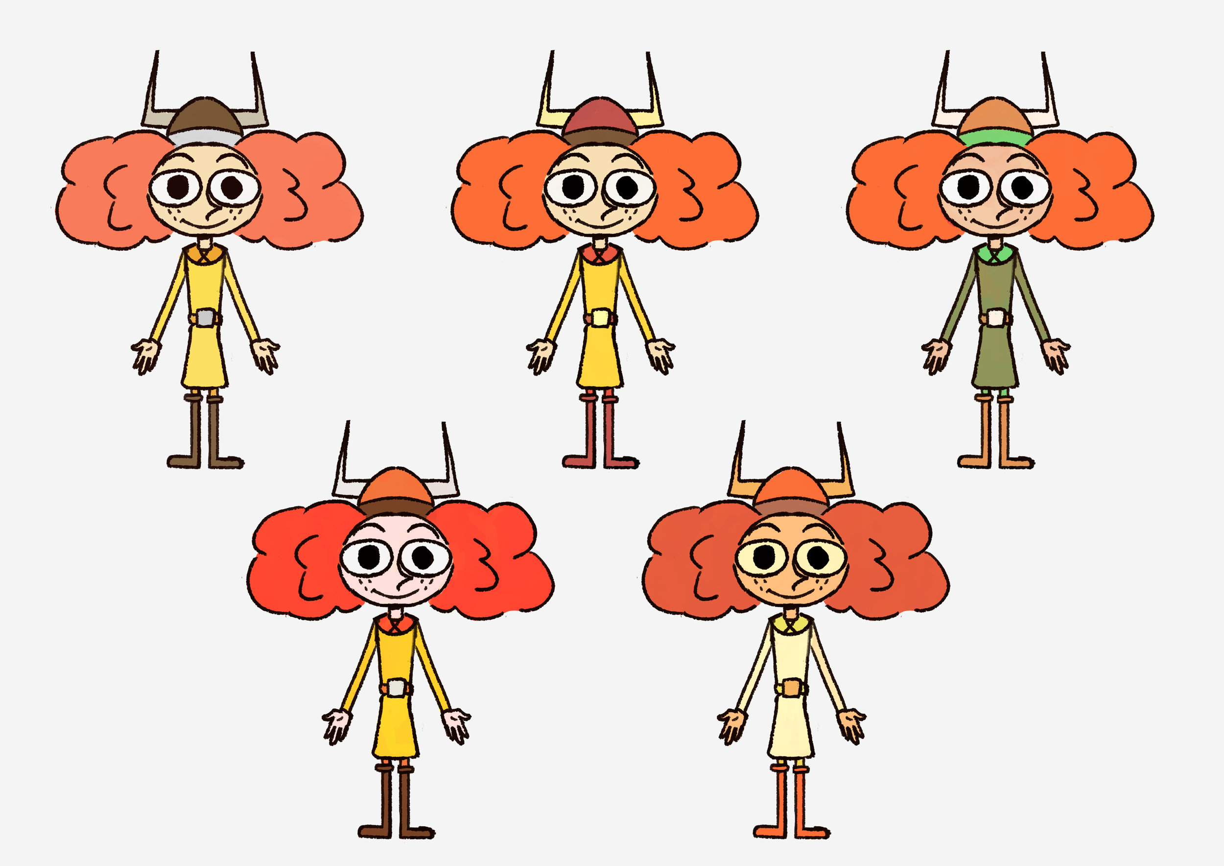
I decieded to simplify the the horns into an easy straight pointy shape instead of the rounded horns, as it’d be easier to draw. She also has quite a short stature with a big head which I thought made her look way more expressive. Having the skinny long limbs make her actions seem way more poignant and curves in her line of action way more obvious. I decided to go with a colour that would compliment her red hair and in researching Viking costumes I found this yellow outfit that I thought fit her very well. The colour would also help her stick out from the mostly blue ocean.

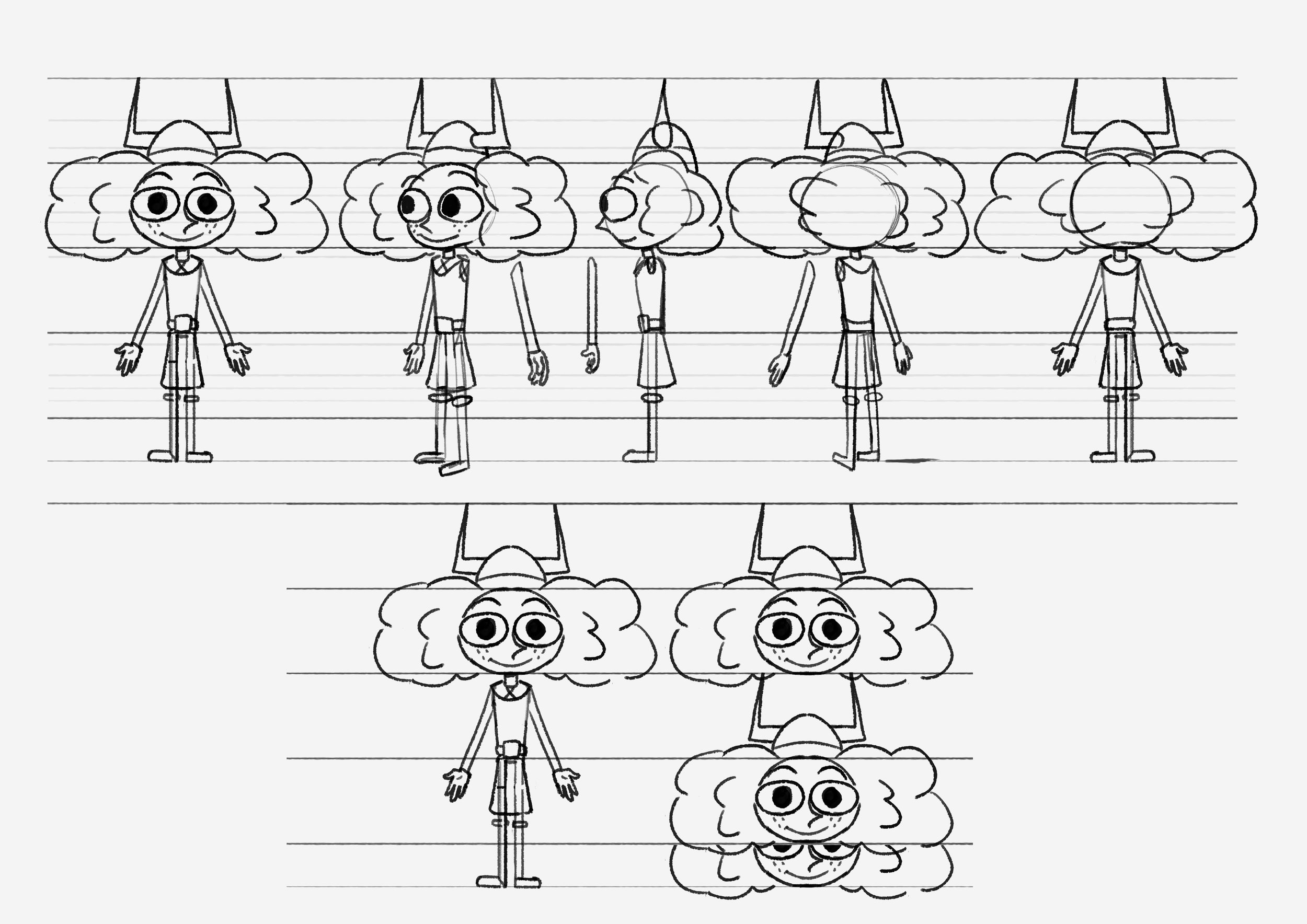
First thing I knew when finalising the design for Kira, was to make her taller than Ethel. Being taller I also wanted to make her slightly more top-heavy/longer so that she had more room to bend for her nervous expressions.
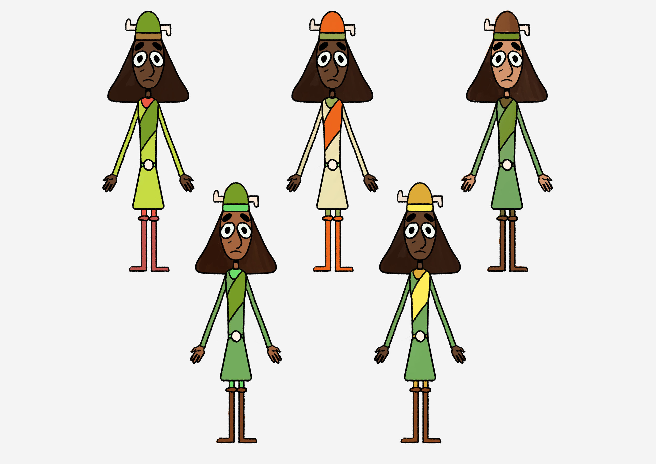

I really liked the facial extressions with her horns acting like extra symbols of her anxiousness. I thought her green costume would have her look close enough to Ethel but have her own colour that seperate her from the ocean.
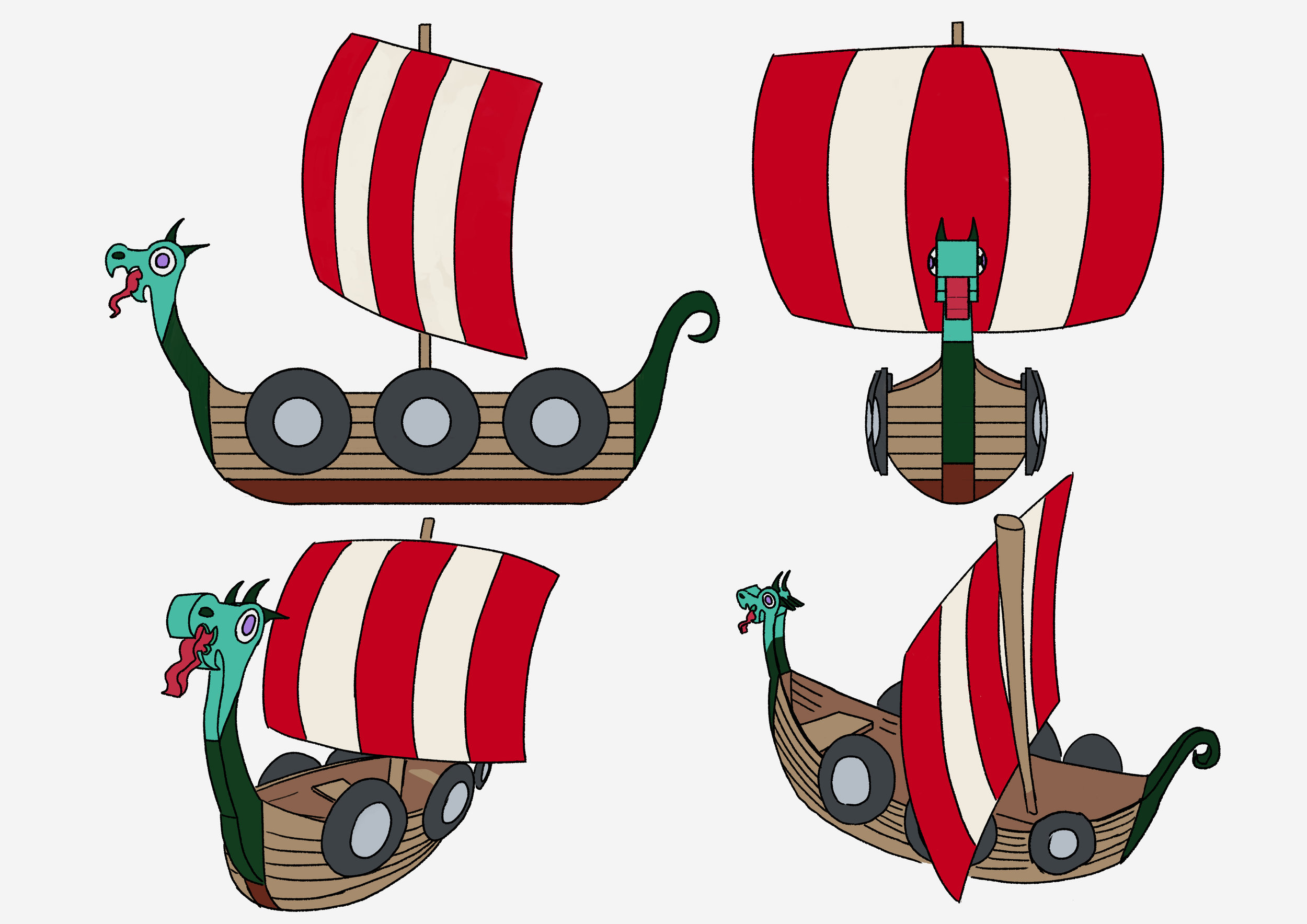
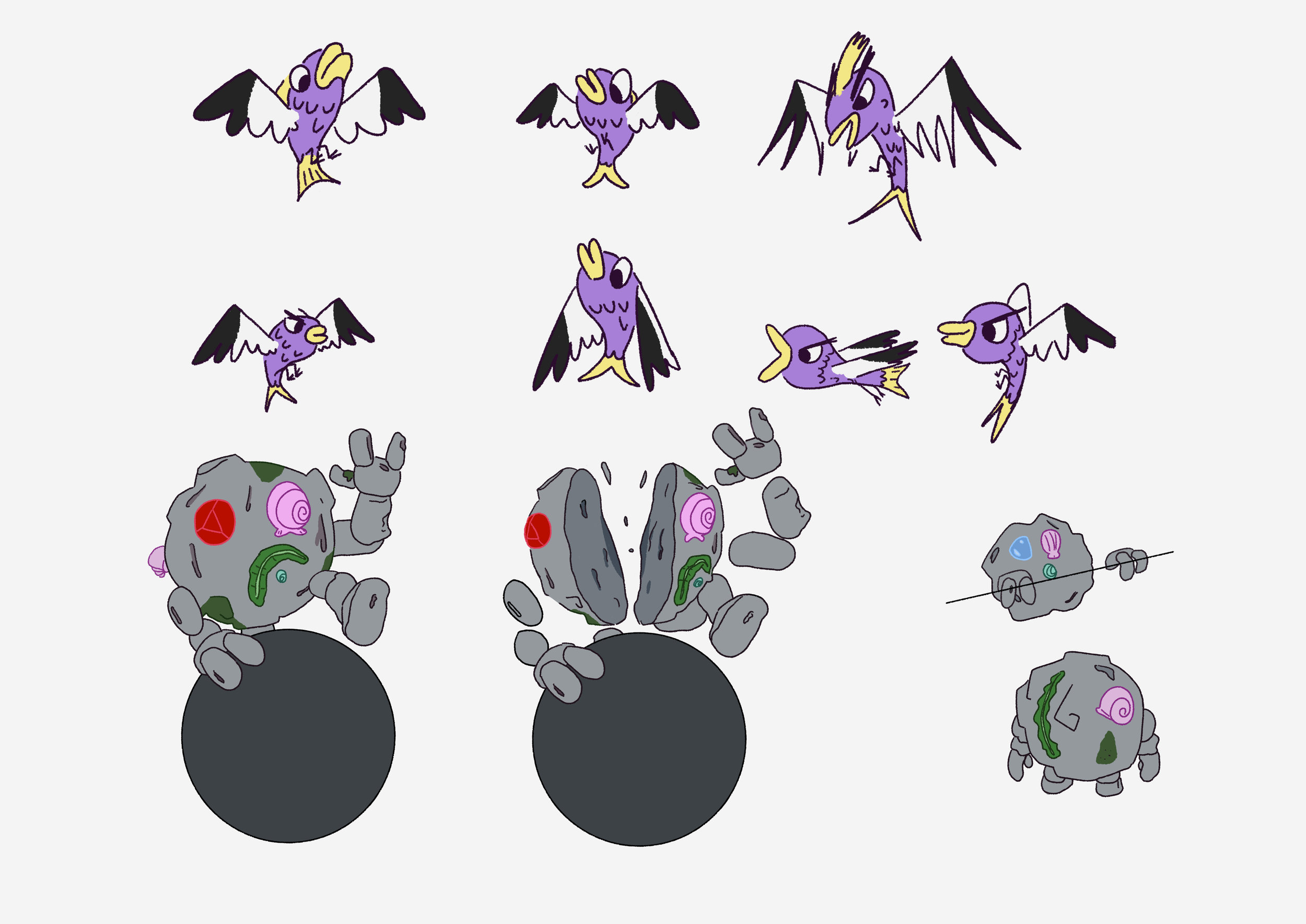
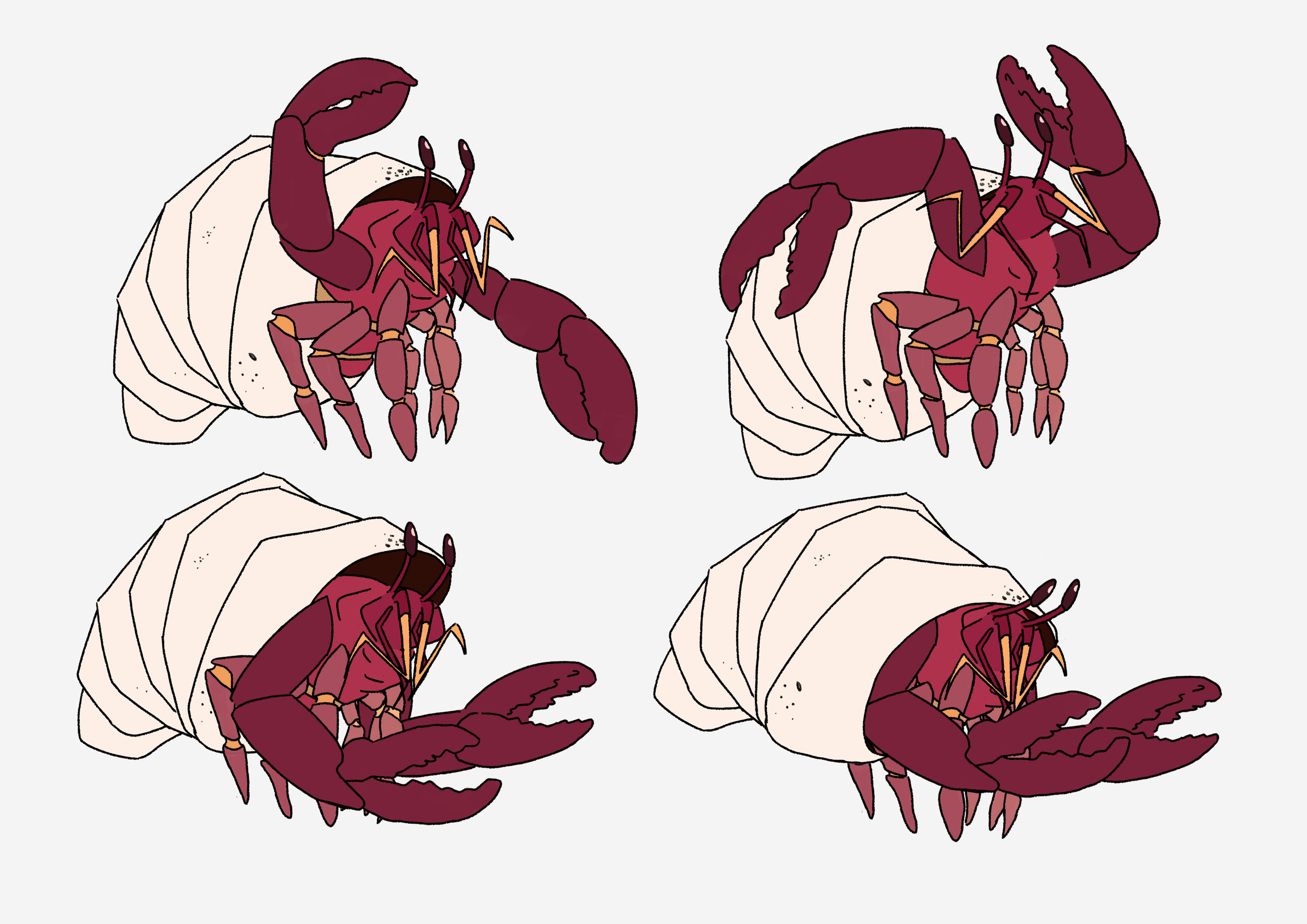
Also, based on previous sketches of the boat and monsters I have compiled final designs for the boat & monsters.